Forbidden Fruit

Idea
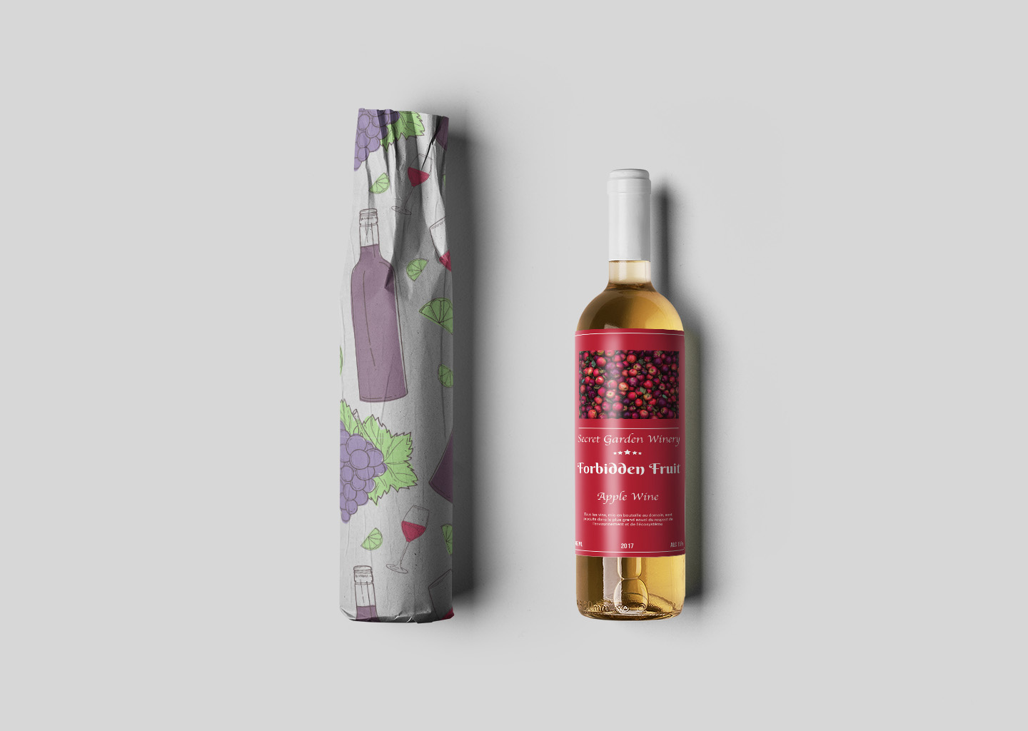
The ‘Forbidden Fruit’ wine captures the allure and mystique of its namesake with a design that’s as unique as its composition—wine crafted from the finest apples. The label and packaging design reflects the product’s natural elegance, featuring a rich tapestry of apple-inspired hues and motifs that promise a taste of the orchard’s forbidden delights. This design was envisioned to not only represent the quality of the wine but also to tell the story of its origin.
Simplicity meets sophistication in the ‘Forbidden Fruit’ wine bottle design. The choice of a clean, modern font and layout on the label ensures that the product speaks to a contemporary audience, while the traditional elements in the imagery pay homage to the timeless craft of winemaking. This juxtaposition is the cornerstone of the product’s visual identity, aiming to attract a market that appreciates both innovation and tradition.
Process
Adobe Illustrator was the tool of choice for bringing the ‘Forbidden Fruit’ wine packaging to life. The software’s precision and versatility allowed for the creation of intricate graphics and the manipulation of text that perfectly aligns with the bottle’s contours. Illustrator’s capabilities in handling vector graphics ensured that every aspect of the design from the vibrant grape and apple illustrations to the elegant typeface was scalable and print-ready.
Our design process was rooted in a deep understanding of product design, particularly in the wine industry. Attention to detail was paramount, as was the ability to adapt and refine visuals to encapsulate the brand story of ‘Forbidden Fruit’. The end result is a packaging design that is not only visually compelling but also reflects the product’s premium positioning in the market.
