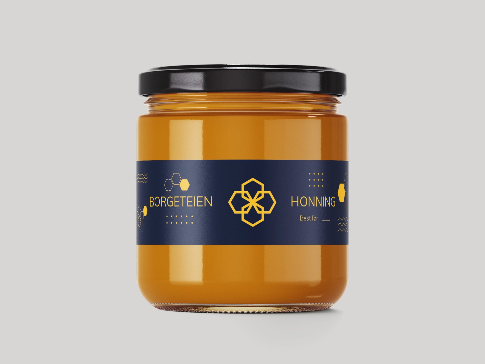
Borgeteien Honning Mini

Idea
Borgeteien Honning Mini is a refined extension of the original label, created specifically for smaller honey jars while preserving the brand’s visual identity. The design retains the key elements of the full-size version: a deep navy background, golden geometric motifs and a minimalist layout, adapted for a more compact format without compromising clarity or elegance.
The label continues the honeycomb-inspired aesthetic, combining visual simplicity with clear product communication. By adjusting the scale and content while keeping the brand tone consistent, the Mini version ensures visual harmony across different packaging sizes. This makes it ideal for gift sets, smaller batch products or premium retail displays.
Process
The Borgeteien Honning Mini label was designed using Adobe Illustrator, chosen for its accuracy and flexibility in working with scalable vector graphics. Typography, spacing and iconography were all carefully rebalanced to suit the smaller format while maintaining legibility and visual appeal.
The design process focused on minimalism, scalability and consistency. Every element was reviewed to ensure it would work effectively on a reduced label size. The result is a compact but premium product that remains unmistakably Borgeteien, showcasing Mitra Consult’s expertise in translating brand systems across formats with precision and style.


