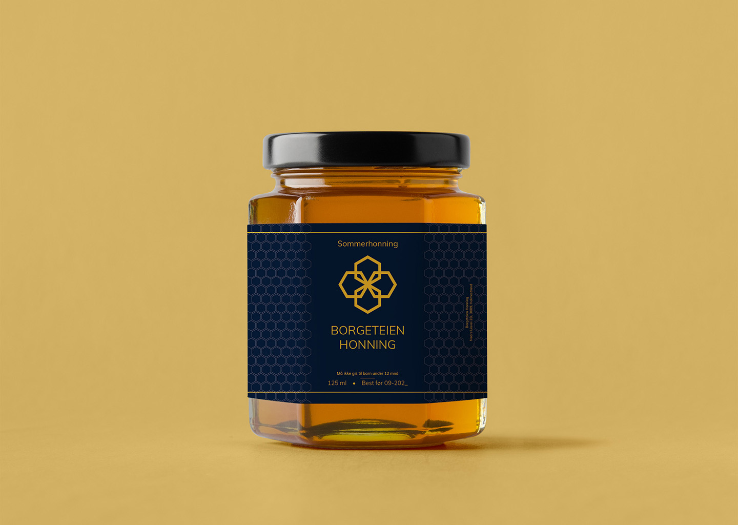
Borgeteien Honnig

Idea
‘Borgeteien Honnig’ reflects the pure essence of Norwegian nature in every jar. This honey, sourced from small-scale producers, is presented in packaging that speaks of quality and authenticity. The design captures the golden hue of the honey, complemented by a deep navy label that exudes premium appeal. It’s a design that doesn’t just aim to attract the eye but also to communicate the product’s natural origins and artisanal value.
The label features a hexagonal pattern reminiscent of a honeycomb, symbolising the meticulous work of bees. This thoughtful design element connects the consumer to the natural process of honey production. The clear, sans-serif typeface and the use of negative space on the label ensure that the vital information is easily legible, reinforcing the brand’s commitment to transparency and simplicity.
Process
In designing the ‘Borgeteien Honnig’ jar, Adobe Illustrator was the chosen tool, perfect for creating sharp, clean lines and managing the intricate patterns seen on the label. Illustrator’s capabilities allowed for precise control over the label’s geometric elements, ensuring a cohesive look that aligns with the product’s premium positioning in the market.
The process was guided by a philosophy of minimalism in product design. Every aspect of the honey jar, from the choice of colours to the typography, was selected to create a harmonious design that stands out on the shelves and encapsulates the brand story. The final design is not only visually appealing but also functional, with a focus on legibility and brand recognition.
