Bee Queen Garden Honey

Idea
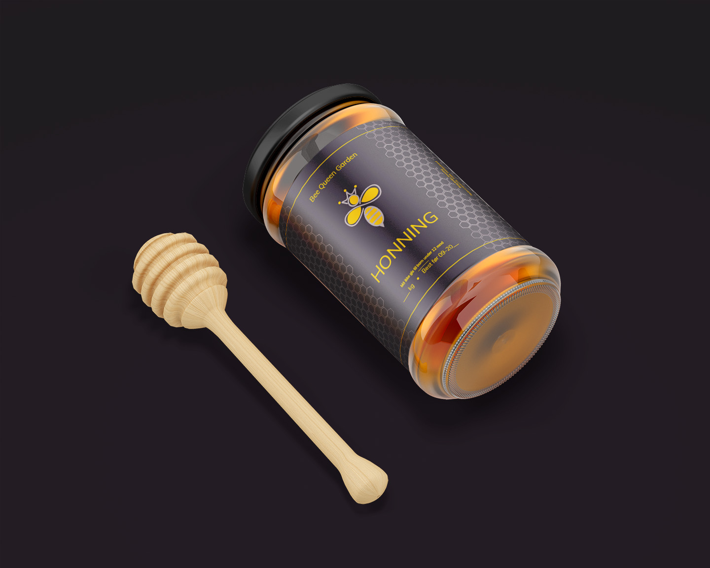
The “Bee Queen Garden Honning” honey jar is a standout product that captures the pristine essence of Norwegian honey. Its label design, featuring the silhouette of a queen bee and honeycomb patterns, reflects the natural origin and premium quality of the honey. The jar is designed to be both aesthetically pleasing and informative, with clear labeling that speaks of the product’s purity and provenance.
The choice of a sleek, transparent jar allows the rich, golden color of the honey to shine through, serving as a visual testament to its quality. This design decision reinforces the product’s connection to nature and the authenticity of the Bee Queen Garden brand.
Process
Adobe Illustrator’s precision and versatility were crucial in the creation of the jar’s label. From the intricate honeycomb background to the elegant typography, Illustrator enabled a level of detail that reflects the craftsmanship of the product itself. The design process was thorough, ensuring that every element on the label was perfectly rendered to represent the high standards of Bee Queen Garden Honning.
This meticulous approach extends to the honey dipper, which is crafted to complement the jar, echoing the natural and artisanal theme of the product. Each part of the packaging has been thoughtfully considered, resulting in a honey jar that stands out on the shelf and captures the essence of the product within.