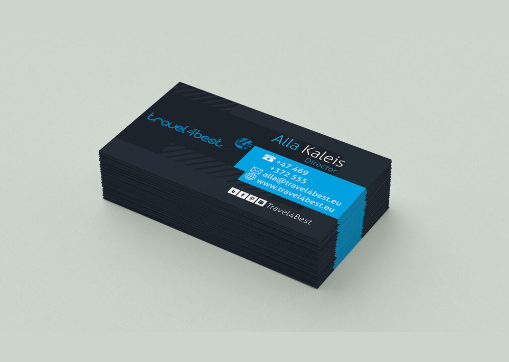
Travel4Best Business Card

Idea
The Travel4Best business card conveys a strong brand identity for a Norwegian company specialising in tailor-made tours. The card’s deep blue palette evokes the reliability and depth of the travel experiences they offer, while the contrasting bright blue accents highlight the company’s dynamic approach. The card’s design is sleek and modern, with a clear hierarchy of information that makes contact details instantly accessible.
The bold, sans-serif font used for the company name ensures brand recognition, and the orderly arrangement of contact information demonstrates the company’s commitment to organisation and attention to detail. This design not only serves as a practical tool for networking but also as a reflection of the company’s professional image.
Process
Created using Adobe Illustrator, this business card is the result of a meticulous design process focused on print design excellence. Illustrator’s advanced tools enabled the precise layout and colour accuracy needed for high-quality business cards that stand the test of time. The design was iteratively refined to achieve the balance between aesthetic appeal and functional layout.
The chosen design elements, from the font selection to the logo placement, are deliberate choices to align with Travel4Best’s branding strategy. The end product is a business card that effectively markets the bespoke travel services offered by the company, ensuring that each cardholder remembers the brand and its commitment to crafting exceptional travel experiences.
