Mirax Catering Menu

Idea
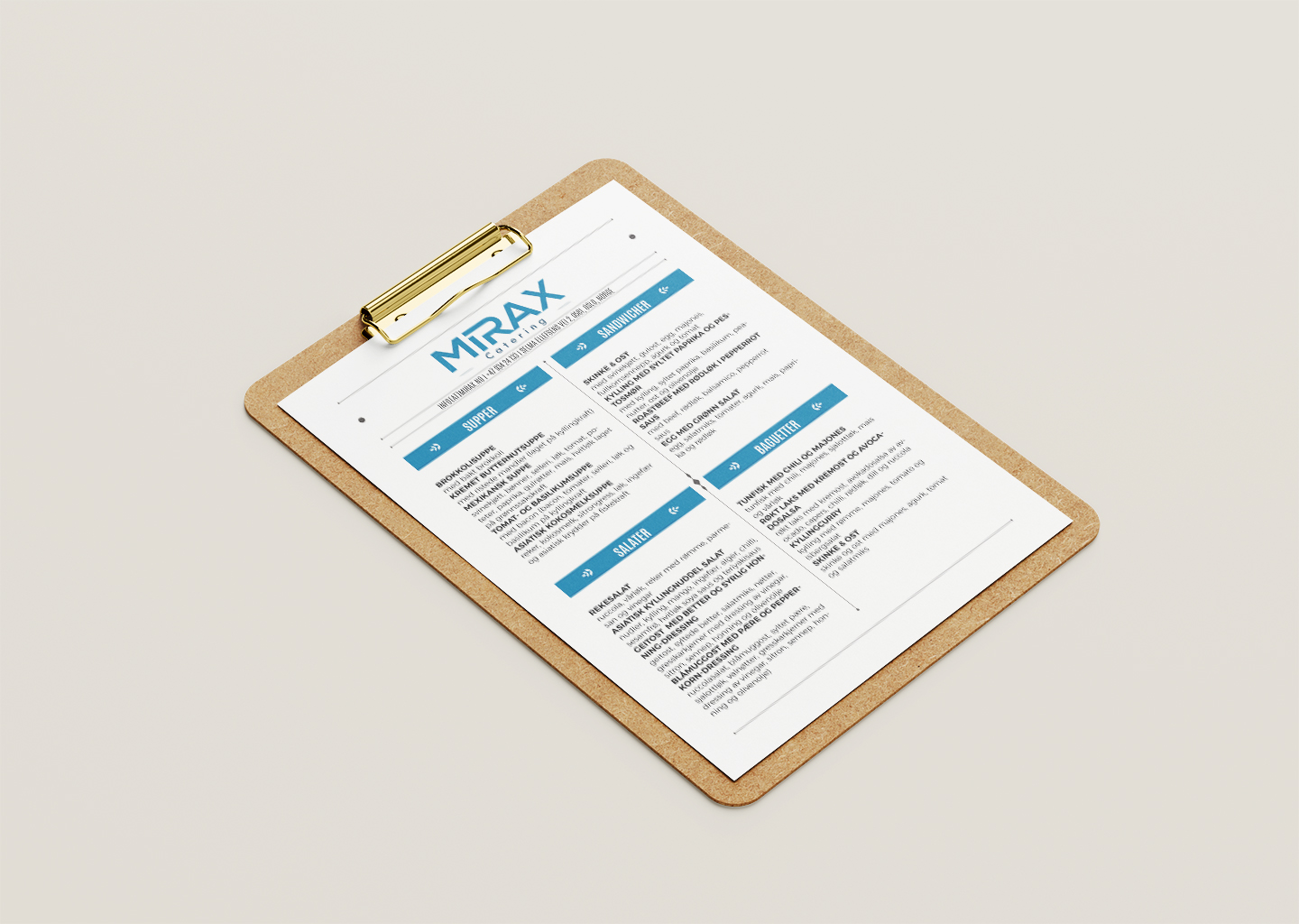
The menu design for Mirax Catering, a prominent catering service in Norway, was centered around the concept of simplicity and accessibility. Recognizing that catering menus need to be both informative and easy to navigate for diverse event planners and customers, Mirax Catering aimed to present their offerings in a clear and concise manner. The menu needed to showcase a variety of food options available, from starters and sandwiches to salads and main courses, all on one page to facilitate quick decision-making.
Process
The design process was carried out using Adobe InDesign, known for its strong layout tools and capability to handle complex text and graphics with ease. We began by laying out a structured format that would categorize the food items into clearly defined sections, each with readable headings to guide the reader through the menu effortlessly.
We chose a clean, sans-serif font for the body text to enhance readability and opted for bold headings to create a visual hierarchy that draws attention to each section methodically. The color scheme was kept minimal, using the brand colors of Mirax Catering to maintain a professional and cohesive look.
The layout was designed to be printer-friendly, ensuring that the menu could be easily printed for distribution at events or during client meetings. Graphic elements were used sparingly but effectively to add visual interest without overwhelming the content. The final product was a streamlined, one-page menu that allowed customers to quickly understand the offerings of Mirax Catering without unnecessary complexity.