Maison de Troska

Idea
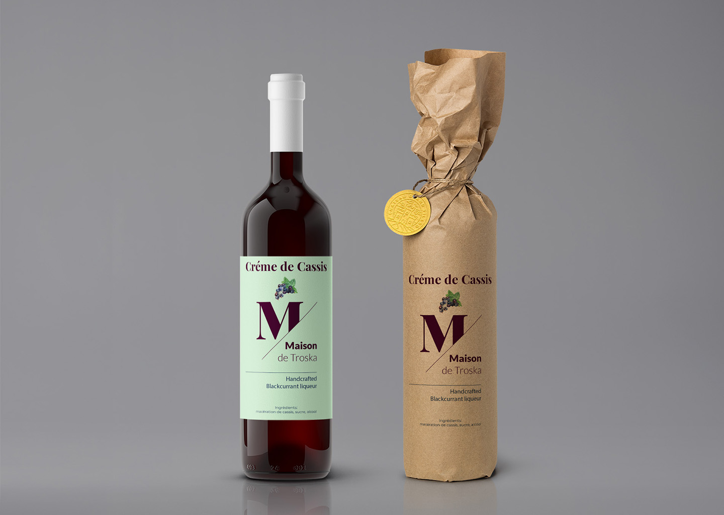
‘Maison de Troska’ presents its exquisite Crème de Cassis with a design that embodies the essence of artisanal craftsmanship. The label’s aesthetic is clean and sophisticated, highlighting the product’s premium quality. A delicate balance of classic and contemporary design elements ensures the bottle is both timeless and modern.
The design of the ‘Maison de Troska’ bottle is thoughtfully curated to reflect the rich, indulgent flavour of the blackcurrant liqueur it contains. The pastel colour palette on the label provides a soft backdrop for the bold typography and the intricate illustration of blackcurrant, conveying the product’s natural ingredients and handcrafted nature.
Process
Adobe Illustrator’s powerful design tools were instrumental in creating the ‘Maison de Troska’ bottle design. Precise vector graphics depict the blackcurrant elements with clarity and finesse, while the layout tools ensure every piece of text is perfectly aligned for an elegant finish.
The design process focused on marrying functionality with aesthetic appeal. Each element on the bottle’s label was meticulously crafted to ensure the design tells the story of the brand and appeals to the discerning customer. The outcome is a bottle design that stands as a hallmark of quality in product design, specifically within the niche of crème de cassis liqueurs.
