Fiterra Presentation

Idea
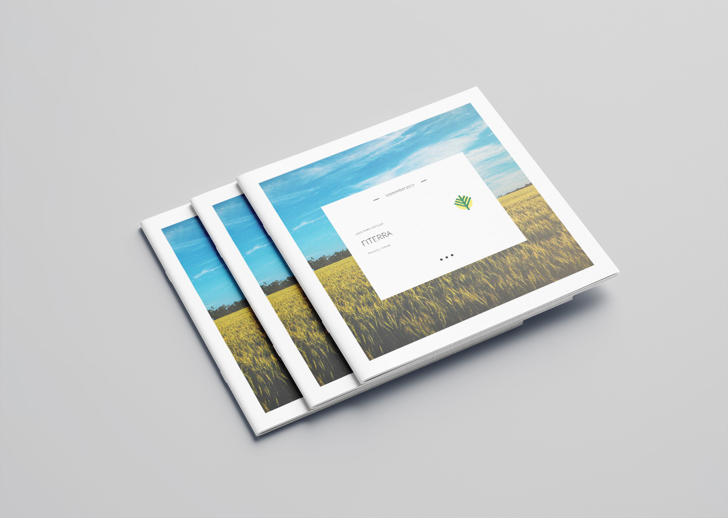
The business presentation for Fiterra, a company specialising in humic fertilisers for soil fertility, was designed to showcase the product’s benefits and applications clearly and attractively. The aim was to create a visually engaging square brochure that provides comprehensive information on how Fiterra’s fertilisers improve soil health and crop yields. We wanted the presentation to be both informative and easy to understand, appealing to agricultural professionals and potential clients alike.
Process
Using Adobe InDesign, we set out to create the Fiterra brochure, taking advantage of its powerful layout and design features. We started by organising the content, making sure all essential information about the product and its benefits was included and easy to follow.
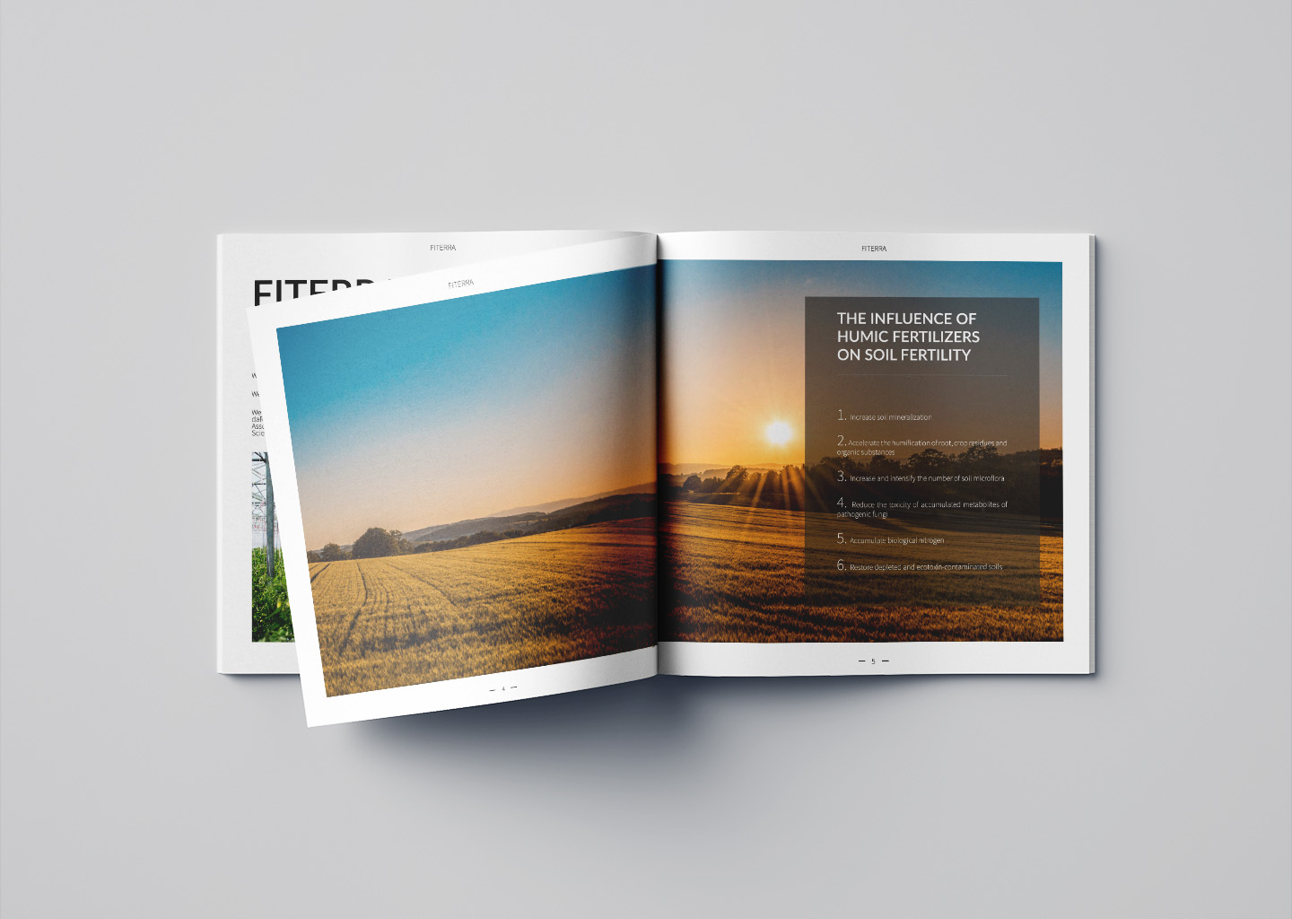
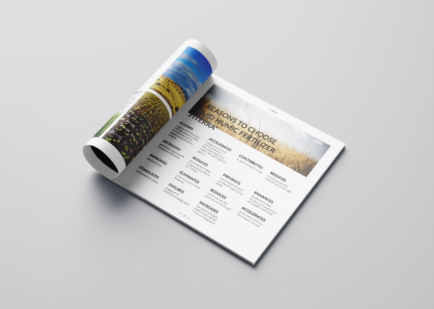
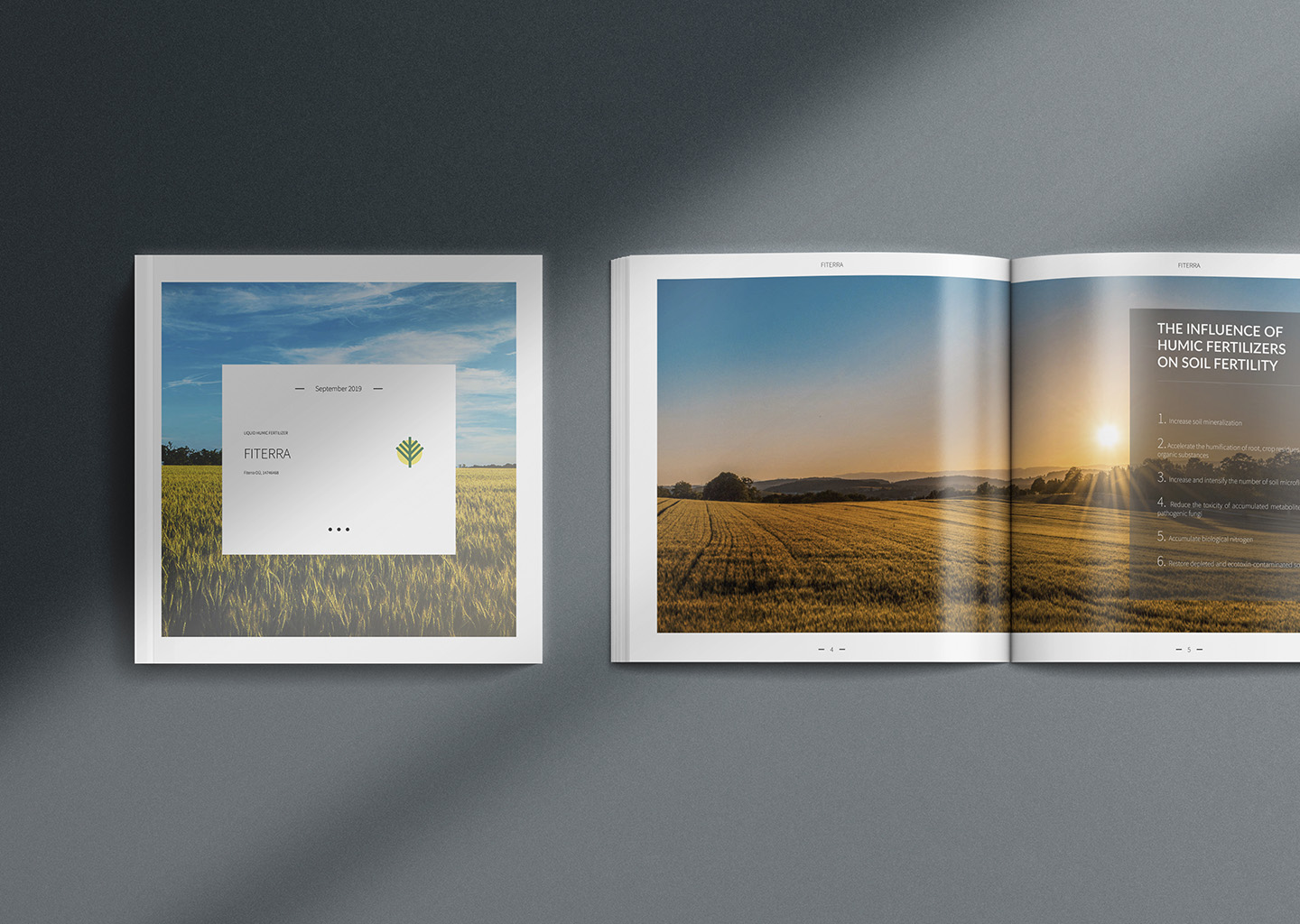
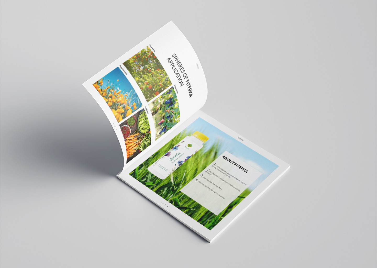
We opted for a square format to give the brochure a unique, modern appearance. Each page was designed with a focus on visual appeal, featuring high-quality images of fertile fields and healthy crops to illustrate the effectiveness of Fiterra’s products. The layout was kept clean and simple, using bullet points, infographics, and concise text to present the information clearly.
We chose typography that is easy to read and complements the overall design. The colour palette was selected to reflect the natural and agricultural theme, with harmonious tones that enhance the brochure’s visual appeal. We carefully balanced text and visuals on each page to ensure the brochure is engaging and informative.
The final brochure is a professional, easy-to-read document that effectively communicates the advantages of using humic fertilisers, while also visually engaging the reader, making Fiterra an appealing choice for enhancing soil fertility.
