Dandelion Redesign

Services
Website redesign and development tailored for multi-language accommodation platform.
- Website redesign – complete visual refresh and improved layout
- UI and UX – clear structure and intuitive browsing for users
- Website build – scalable setup for large multilingual content
Deliverables
Key features and assets delivered as part of the website relaunch.
- 100 pages and counting
- 3 languages
- Gallery – accommodation visuals
- Icons
- Style guide
- WordPress build
- Divi Page Builder
- Smoobu integration for booking management
- Booking system setup
Extras
Additional enhancements that improve usability and help attract new guests.
- Optimisation – improved speed and performance
- Analytics – traffic tracking setup
- Apartment filtering – dynamic user navigation
- Reviews – testimonial system
- SEO – metadata and keyword implementation
Project Goal
The Dandelion Apartments redesign project aimed to transform an outdated website into a modern, scalable platform to support the growth of an apartment rental business in Riga. The key objective was to improve usability, boost performance, and increase online visibility to attract both local and international guests.
Built with the Divi Theme Builder on WordPress, the new website features a clean, responsive design that allows the client to manage and update content independently. The refreshed visual identity and improved site structure support the brand’s long-term goals, ensuring a smooth experience for users across all devices.
Our Approach
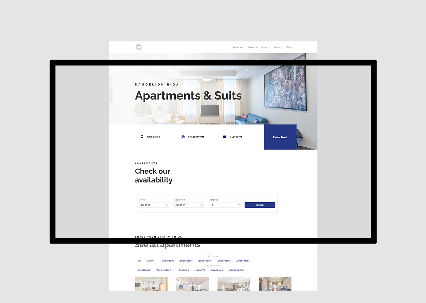
One of the main issues with the original site was its slow performance, especially due to image-heavy galleries. To address this, we replaced carousels with optimised static images and implemented lazy loading. This significantly improved loading times and reduced the size of key pages like the homepage and individual apartment listings.
We also developed a dual filtering system to help users find apartments based on both location and size. This was essential, as the number of listings continues to grow. By using a flexible plugin, we created a sorting feature that simplifies navigation and enhances the user journey.
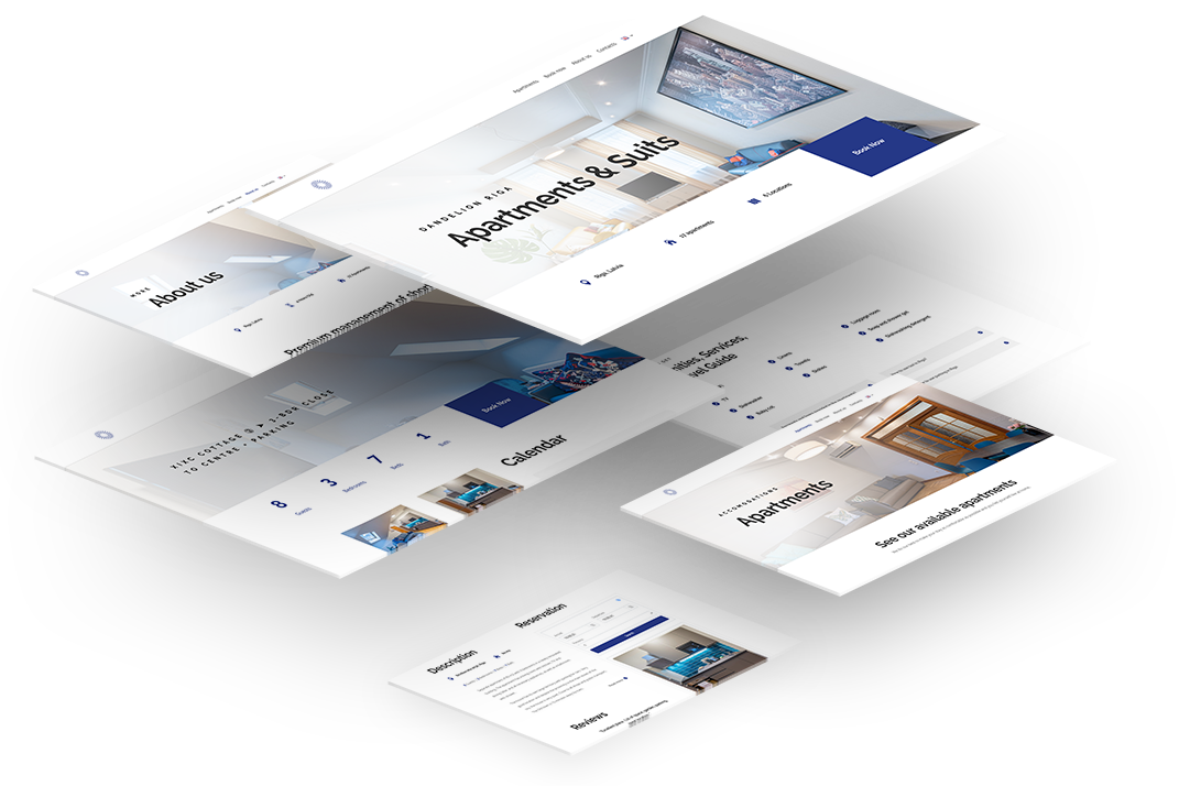
Each apartment page was restructured to present key information clearly and support conversions. These updates included better content layout, integrated booking features, and SEO enhancements like meta descriptions, structured data and targeted keywords.
The result is a fast, mobile friendly and search engine optimised website that supports Dandelion Apartments’ expansion in Riga and provides a seamless experience for users searching for rental accommodation.
