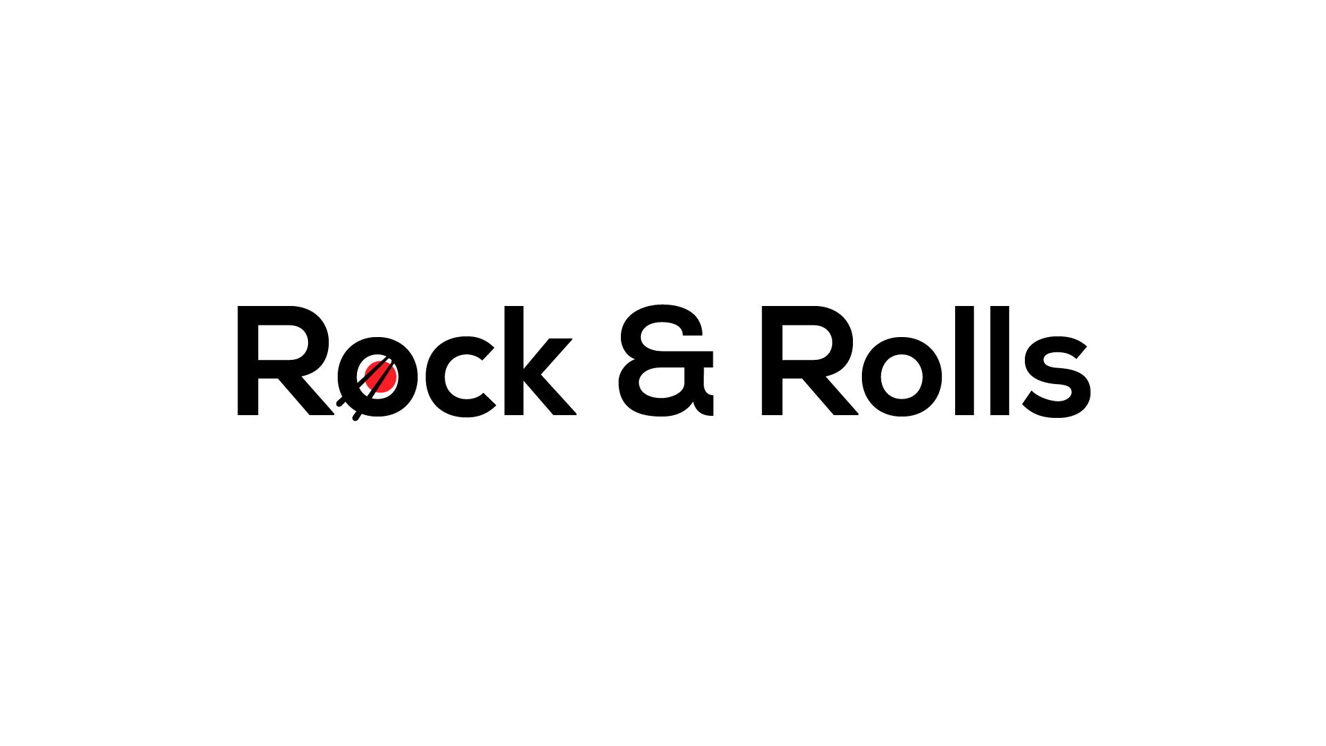
Rock and Rolls Logo

Idea
The logo for Rock & Rolls, a sushi spot in Norway, was inspired by a play on words that bridges music and sushi – a combination as intriguing as the sushi they offer. The client wanted a logo that was straightforward yet memorable, reflecting the simple, clean lines of sushi rolls themselves. It had to be instantly recognisable, suggesting a place where sushi meets a vibrant, modern vibe.
Process
Adobe Illustrator was the chosen tool for its precision and versatility, which is essential for creating logos that are both simple and impactful. We started with the name ‘Rock & Rolls’ and played around with different typography and iconography that could cleverly represent both the rock music aspect and the sushi rolls they serve. The process involved experimenting with different fonts and graphics, ensuring the final design would be clear and effective across all mediums – from storefront signage to online platforms. The result is a sleek, bold logo that encapsulates the unique fusion of rock music energy and the culinary art of sushi making.

