Liveat Green Food Packaging

Idea
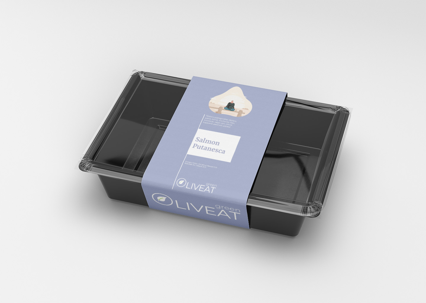
Liveat’s packaging design embodies the freshness and vitality of their healthy food range. This Estonian company has chosen a clean and modern approach for their food label design, which immediately communicates the wholesome quality of the product inside. The vibrant colours correspond with the type of meal, from the leafy greens of the Caesar Salad to the earthy tones of the Chicken Ballotine and the marine hues of the Salmon Puttanesca, creating an intuitive visual language for consumers.
The design utilises a minimalist style, with clear, sans-serif typography that makes the essential information highly legible. Each label features an illustrative element that captures a scene related to the dish, adding a touch of personality and storytelling to the packaging. It’s a strategic way to engage consumers and stands out on the shelf as a badge of health and quality.
Process
The creation of the Liveat packaging was performed using Adobe Illustrator, a leading vector graphic design software. Illustrator’s precise tools allowed for sharp, clean lines and the manipulation of vibrant colours to produce a design that’s both attractive and practical. The software’s capacity for detailed graphic design ensured that each element, from the logo to the nutritional information, was crafted to perfection.
Through Illustrator, designers were able to create a uniform look across various product lines, maintaining brand consistency. The process involved developing a template that could be easily adapted for different meals while keeping the brand’s visual identity strong. This streamlined approach is effective for brand recognition and appeals to consumers who value both aesthetics and health-conscious eating.